|
|
Post by dalrymple on Apr 3, 2005 13:44:45 GMT -5
It could be much worse, like those Australia/Asia "Noble House" DVD's with the large print across the cover -- "Her Love Was Not Enough" -- what the hell? that sounds like the title of some corny romance novel! ugh!!  anyhoo, my line-suggestion for the RS-cover would be: one passport is not enough ;D |
|
|
|
Post by Ace on Apr 3, 2005 13:53:53 GMT -5
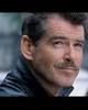
SZ aside, the more I look at the cover art the less it does for me. Tux <check> Pose <check> But to cut off the head just above those expressive eyebrows? Wasn't the show on some very deep level about Mr. Steele's hair? LOL! Maybe the hair was in that particular pose was too much 1st season hair and not enough 4th season.  Though we do get the hair on the side cover. What's really wrong with the photo is he isn't smiling or even smirking! Yes Steele could be serious and there are serious poses (like this one) but that wasn't his normal state of grace. I do like the arched brow though.  Ace |
|
|
|
Post by Ace on Apr 3, 2005 13:55:03 GMT -5
anyhoo, my line-suggestion for the RS-cover would be: one passport is not enough ;D I'd love that!  Ace |
|
|
|
Post by Lauryn on Apr 3, 2005 14:10:37 GMT -5
Maybe the hair was in that particular pose was too much 1st season hair and not enough 4th season. Though we do get the hair on the side cover. Good point. I should count my blessings. Really it looks more like a second season head shot than a first, anyway. Precisely. One has to cry foul. It's about simulating a saleable Bondish pose rather than a Steeleish one. It doesn't at all suggest the devil-may-care lightheartedness of the show in general and the spritely first season in particular. |
|
|
|
Post by lotsofluck on Apr 3, 2005 14:27:37 GMT -5
This photo looks like Bond to me......not Steele. Steele would be untied and slightly unbuttoned.
And it looks like the photo was done by a non pro who cut off the top of the head.(I have dozens of photos of family members with the top of the head cut off.)
What I can see of the photo on the side of the box looks like the hair on the top of his head is standing on end.Wish we could get a good view of the side. Maybe thats why they cut the top of the head off on the front.
I agree that SZ should be displayed along with PB on the RS tapes. She and her character were the reasons for the show. Wasn't there a comment by one of PB's leading ladies that it took her hours in makeup daily to look as beautiful as her leading man. I think SZ accomplished that for 5 years.
|
|
|
|
Post by Ace on Apr 3, 2005 14:52:40 GMT -5
This photo looks like Bond to me......not Steele. Steele would be untied and slightly unbuttoned. And it looks like the photo was done by a non pro who cut off the top of the head.(I have dozens of photos of family members with the top of the head cut off.) What I can see of the photo on the side of the box looks like the hair on the top of his head is standing on end.Wish we could get a good view of the side. Maybe thats why they cut the top of the head off on the front. I agree that SZ should be displayed along with PB on the RS tapes. She and her character were the reasons for the show. Wasn't there a comment by one of PB's leading ladies that it took her hours in makeup daily to look as beautiful as her leading man. I think SZ accomplished that for 5 years. Steele was only unbottoned when it came to shirts and casual dress, not tuxes. "Remington Steele never goes anywhere rumpled" The photo is one from his time on RS (and unlike us, professional photographers rarely cut off heads accisdently). It definitely has a full head which can be seen on the side photo. It's just the affect they were going for with that cropping. That and I really think they are trying to downplay the 80's hair. As for the reason of the show, no matter how it was initially conceived by episode 1 it's was pretty much slanted toward his character; he was the break out star. Like Fonzie on Happy Days who wasn't even a regular when the show started. It sometimes happens. Still she was a huge part of the show which was still very much about their pairing and should be on the cover. And sorry can't agree, while SZ's a very pretty woman (prettier without all the makeup they tried to bury her under as the series progressed in a misguided effort to make her look more sophisticated), PB's a stunningly beautiful man. Ace |
|
|
|
Post by Lauryn on Apr 3, 2005 17:27:19 GMT -5
The photo is one from his time on RS (and unlike us, professional photographers rarely cut off heads accisdently). It definitely has a full head which can be seen on the side photo. It's just the affect they were going for with that cropping. That and I really think they are trying to downplay the 80's hair. Noble impulse for those of us who remember the 80's but is it really? It all goes back to the same manipulation of image -- the hairstyle is Steele, it dates PB and distances him from Bond and so it gets the chop. Think of a show with a similar dynamic (detective comedy/drama, two co-leads, one of whom went on to became a top-lining film star) that is, Moonlighting. History is not being re-written; Bruce Willis' mug doesn't hog the cover of their (admittedly few) DVD releases. (I can just picture Cybill Shepherd going thermo-nuclear. All that unprintable invective! Someone would get their ears singed and if they were male, a swift kick in the cojones. (Special to Fox: Stephanie Zimbalist can do more than just run in high heels.) |
|
|
|
Post by Ace on Apr 3, 2005 17:40:06 GMT -5
Noble impulse for those of us who remember the 80's but is it really? It all goes back to the same manipulation of image -- the hairstyle is Steele, it dates PB and distances him from Bond and so it gets the chop. Well it's not as if he didn't have short hair in 3rd Season and it's perfectly gorgeous and rather modern in the 4th. It's also shorter than it is in Goldeneye. Maybe they just didn't have the right pose to go with the right hair. Personally I'd prefer that one that used in that People anniversary issue/book, with him lounging and the tie undone. Hmmm... Come now, everyone knows Cybil is far more formidable and scary as heck, even if she only wore sneakers. But I do wonder what the new Moonlighting DVD case looks like. The main difference though is that Moonlighting was a bigger hit than RS, it sells itself more as a show. The primary selling point of RS though is now PB. They probably rightly think RS fans will buy the DVD regardless of cover art and they want to lure in PB and Bond fans, some of whom have never seen RS. I still think the Bond mention is idiotic, everyone knows he was Bond so duh. Just tacky. Ace |
|
|
|
Post by Lauryn on Apr 3, 2005 18:05:18 GMT -5
Point taken on Moonlighting. All those gongs and awards and the broken crockery and the flaming gossip and the backstabbing -- and that was just offstage! That slam/bang duo was too famous to break up (at least in the television history books).
Ooh la, la! I remember it well. That, my lovelies, should be the centerfold insert!
And to the Academy Awards, too.
|
|
|
|
Post by steeleinc on Apr 3, 2005 19:02:57 GMT -5
I never in a million years thought I'd be sad, disappointed and angry about the cover art to the much anticipated RS DVD - but I am. The cover art is also a slap in the face not only to SZ, but to "Remington Steele" and its fans. Any way we can let FOX know how we feel about this?
Debra
<That cover art is too Bond and a slap in the face to Stephanie Zimbalist. Let's hope it's not the final decision on how it will come out.
|
|
|
|
Post by Ace on Apr 3, 2005 19:51:35 GMT -5
You can write to the Fox DVD rep and express displeasure. But frankly if they think this cover will make them $1 more than a more series representational one they'll use this one. DVD covers like posters are about commerce, not art or truth.
Personally, if it sells more and that means I'm getting Seasons 2-5, I don't care if the next cover just has Doris Roberts on it.
I'm really more concerned about the content than the packaging. I want a 6 disc set, especially considering they're doing all these features. I don't want the picture and sound degraded just because they're too cheap to spend a few more pennies on two more discs.
Ace
|
|
|
|
Post by curious george on Apr 4, 2005 7:44:30 GMT -5
Yo, Fox!! You taking notes on all this? These people know what they're talking about. cg (unless, of course, the season 2 Doris Roberts cover is Marie Barone and not Mildred -- DR "before she was an obnoxious mother-in-law!") ;D |
|
|
|
Post by Myrtle Groggins on Apr 4, 2005 13:41:07 GMT -5
"And sorry can't agree, while SZ's a very pretty woman (prettier without all the makeup they tried to bury her under as the series progressed in a misguided effort to make her look more sophisticated), PB's a stunningly beautiful man. Ace" They didn't bury her under makeup because she isn't pretty, they buried her under makeup because that was the style of the times in the 1980s. Big hair, big shoulders, tons of makeup. Fortunately for Stephanie, they didn't do too many shoulder pads, and while the hair was a bit much in the later seasons, it wasn't always so. I saw an episode of Who's The Boss the other night, and every female on the show had the big hair, the big shoulder pads, and heavy makeup, including the young daughter!!  Oh so 1980s. Remember Dynasty? Big hair, big shoulders, heavy makeup. It wasn't just Stephanie. |
|
|
|
Post by Myrtle Groggins on Apr 4, 2005 13:51:27 GMT -5
Yo, Fox!! You taking notes on all this? These people know what they're talking about. cg (unless, of course, the season 2 Doris Roberts cover is Marie Barone and not Mildred -- DR "before she was an obnoxious mother-in-law!") ;D Oh, no! Marie Barone! That's too funny. I was hoping the second season DVDs would have all 3 of them on the cover, SZ, PB and DR, but since Everybody Loves Rayomnd is in its final season, they might decide to go with just PB and DR!! Of course, we do want them to do more than one season, so I guess whatever they think will sell, would be the way to go. However, I still think SZ should be on that cover, taking up a equal amount of space as the guy in the tux. |
|
|
|
Post by Lauryn on Apr 4, 2005 14:09:17 GMT -5
You can write to the Fox DVD rep and express displeasure. But frankly if they think this cover will make them $1 more than a more series representational one they'll use this one. DVD covers like posters are about commerce, not art or truth. It’s a cold calculation but of course not surprising, nor is it to be dismissed from a dollars and sense standpoint. We all knew the series would be sold on the back of Bond, but what rankles a bit is that that they’ve done it in such a crass and ham-handed way. There is room for compromise. Not all poster or cover art features only the most bankable actor’s face or form. One can use smaller photos, backgrounds, or inserts for co-stars. It can be done and still have a clean, elegant design. I don’t know that it dilutes the “brand” they’re flogging to any large degree by having SZ on the DVD cover, even near or equally sized. It may be the marketing department’s perception but I’m not sure that it will make much difference to the balance sheets. It’s a bit reductive to think so, IMO. Bond fans would be inclined to see her as window dressing. Like most DVD buyers they are used to seeking out favorite actors in different shows or films and can surely pick a Brosnan product off the shelf without much trouble. If they’re seriously thinking of spending $39.98 they probably have some inkling that PB starred in this 80’s TV show (that famously lost him the Bond role) and that he had a female co-star. Put Brosnan in black tie on the cover wearing a very dangerous smirk and that female on his arm (that’s all Bond-ish, as well, no?) and there you have it. I like the lettering and the cooler hues and the pose is nice, though I’d prefer a more roguish expression. That “Before he was Bond” tag is the mirror image of the commercial for the RS marathon that ran on A&E around the time of Goldeneye. It used the same slogan, with an episode clip montage of Steele doing “Bondish” things but it was all very tongue in cheek (which is the only way to get away with it in my book). When all’s said and done that’s the bottom line for me, too. I’d rather lobby for six discs -- breathing room for extras and a full-bodied and pristine transfer -- than go to the barricades over the cover art (which might well change with the prevailing wind, anyway). |
|
|
|
Post by Ace on Apr 4, 2005 16:03:29 GMT -5
"And sorry can't agree, while SZ's a very pretty woman (prettier without all the makeup they tried to bury her under as the series progressed in a misguided effort to make her look more sophisticated), PB's a stunningly beautiful man. Ace" They didn't bury her under makeup because she isn't pretty, they buried her under makeup because that was the style of the times in the 1980s. Big hair, big shoulders, tons of makeup. Fortunately for Stephanie, they didn't do too many shoulder pads, and while the hair was a bit much in the later seasons, it wasn't always so. I saw an episode of Who's The Boss the other night, and every female on the show had the big hair, the big shoulder pads, and heavy makeup, including the young daughter!! Oh so 1980s. Remember Dynasty? Big hair, big shoulders, heavy makeup. It wasn't just Stephanie. [/quote] I didn't mean they buried her under makeup because she wasn't pretty, I mean it made her less pretty. They made a conscious effort after Season 1 to redo her wardrobe and makeup and hair to give her a more sophisticated and "hip" look from the wardobe that was very collegic and young proper business woman in the first season. She still fared well with suits when they kept the look clean and classic. But didn't fair as well when they tried to "glam her up". Overly spangly & busy dresses didn't suit her, they overpowered her as the makeup and big hair did. Very few women could pull off that look and it flattered fewer of them. I think the look actually only worked for Joan Collins and even she couldn't make those ludicrous shoulder pads work. It also didn't help her look that in comparison Steele still dressed along rather classic lines. He had very few fashion misteps, and usually when they tried to get a too trendy look. But you never saw him sporting Miami Vice glow in the dark unconstructed jackets or wearing a mullet and those were just as 80's as heavy makeup, big hair, shouldar pads and spangly dresses. Ace |
|
|
|
Post by Lauryn on Apr 4, 2005 18:01:22 GMT -5
Come now, everyone knows Cybil is far more formidable and scary as heck, even if she only wore sneakers. But I do wonder what the new Moonlighting DVD case looks like. The main difference though is that Moonlighting was a bigger hit than RS, it sells itself more as a show. .. Ace Ace, or anyone who’s interested, here’s the cover art and details for the upcoming release of Moonlighting: Seasons One and Two. They must have finally ironed out the pesky music clearances, at least for that time frame. As you can see by the cover art Shepherd and Willis are a matched pair.<wink> Cybill must have bought a pair of combat boots to the negotiating table, LOL! www.tvshowsondvd.com/newsitem.cfm?NewsID=3030Before eyebrows are raised about fitting two seasons, commentaries, and features on six discs, Moonlighting didn’t get picked up as a regular show until Sept. of season two so there are only six first season shows plus the pilot and eighteen second season episodes (equals twenty-five). RS’s first season has the standard twenty-two; at four discs vs six RS still comes up rather short. Hmm. Commentaries from both stars and the series’ creator Glenn Caron. I wonder if GC (that fellow behind some of the finest moments of RS’s first season) mentions Remington Steele. It did come first, after all. Some say Moonlighting is only a pale carbon copy <wink> And look, there’s a featurette about the show’s fans! Well I nevah! It seems like Stephanie Z. isn’t the only one being left out of things! |
|
|
|
Post by Ace on Apr 4, 2005 22:27:02 GMT -5
Yes forget about SZ, what about US? I feel so ignored. *sniff* I had an idea about the DVD box but it would scupper their plans for more obvious Bond allusions. They could still keep Pierce front & center and in a tux and still have a photo of SZ on the cover but do it in a very unique RS way. They could use this 1st season photo of Steele and replace the poster behind him with a romantic one of them together and use their names on the "poster" instead. I think it would be very cool, if I do say so myself. I'd do a mock up but my photo shop skills are rudimentary to say the least.  |
|
|
|
Post by Myrtle Groggins on Apr 5, 2005 4:13:21 GMT -5
Hey, Taipan, I like it. Great idea. You can do the "paperwork" and send it to the idiots, I mean TPTB. I now see your point about SZ, the hair, the makeup. Ugh, the 1980s. So when are they going to contact us for the RS dvd interviews? I'm a willing fan. I like the Moonlighting cover, even though I didn't really watch the show. |
|
|
|
Post by Yuliya on Apr 5, 2005 8:31:57 GMT -5
Yes, it's a nice cover, but I like Ace's idea a lot more. |
|


 Though we do get the hair on the side cover.


 Oh so 1980s.